Clay & Co
Strategy + Visual Identity + Website + Social Media
3 minute read
The Starting Point:
Clay & Co started as an extension of ceramic artist Cáit Gould’s practice.
She was moving from a one-person setup into a much larger studio. More space, more classes, more opportunity… but also more pressure to fill it.
Previously, she’d been based in an arts centre that handled a good chunk of the marketing. This time, it all needed to come from the brand itself.
The offer was expanding too.
Alongside one-off workshops and 5-week courses, the new space introduced:
Studio memberships
Guest tutors
Collaborative workshops
So this wasn’t just a new brand.
It was a bigger, more ambitious version of the business that needed to attract the same audience, but at a much larger scale.
And that was the real challenge.
If the classes didn’t fill, everything would feel like an uphill battle from day one.
The Approach:
Define → Launch → Grow
This wasn’t just about making things look nice.
It was about building a brand that people actually connect with, and then making sure there were enough of those people ready to book when the doors opened.
STEP 1.
Define: Figuring Out What This Actually Is
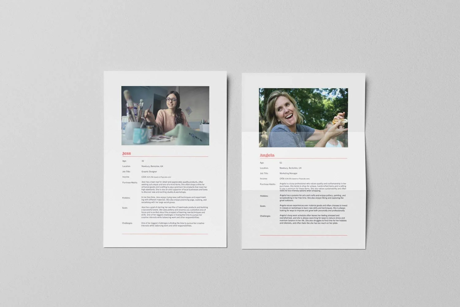
Before jumping into design, we needed to pin down what Clay & Co actually is.
What kind of studio is this?
Who is it for?
Why would someone choose this over anything else?
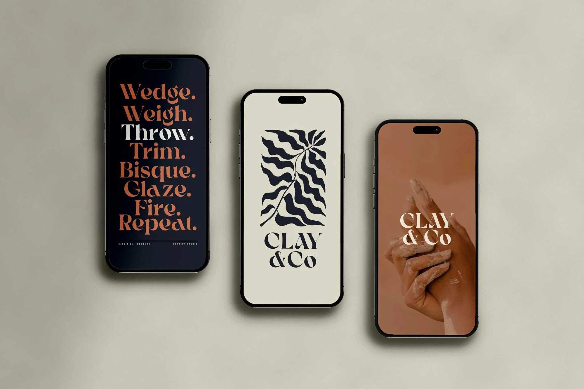
We shaped something that feels:
Calm, welcoming, and a bit of an escape
Community-led, not just a place to take a class
Beginner-friendly, but still appealing if you want to take it seriously
Subtly premium, a space you actually want to spend time in
There was also a strong focus on student development, but communicated in a warm, friendly way rather than anything too formal or intimidating.
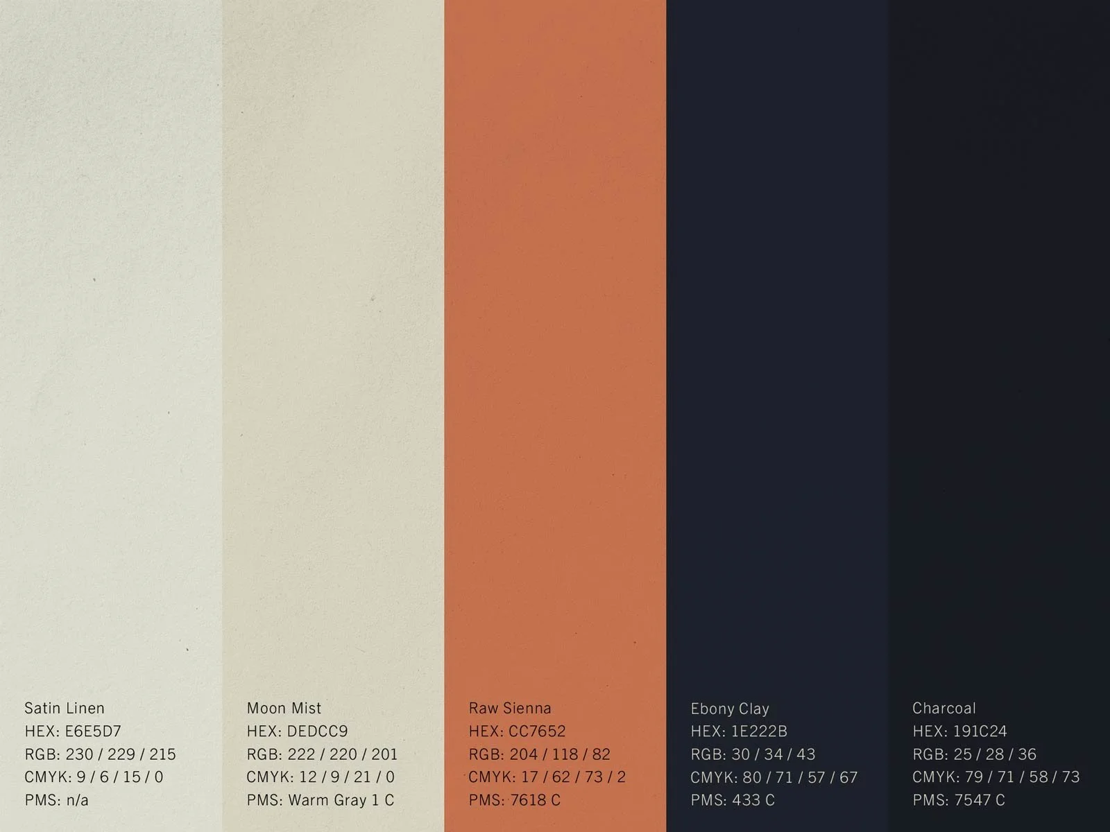
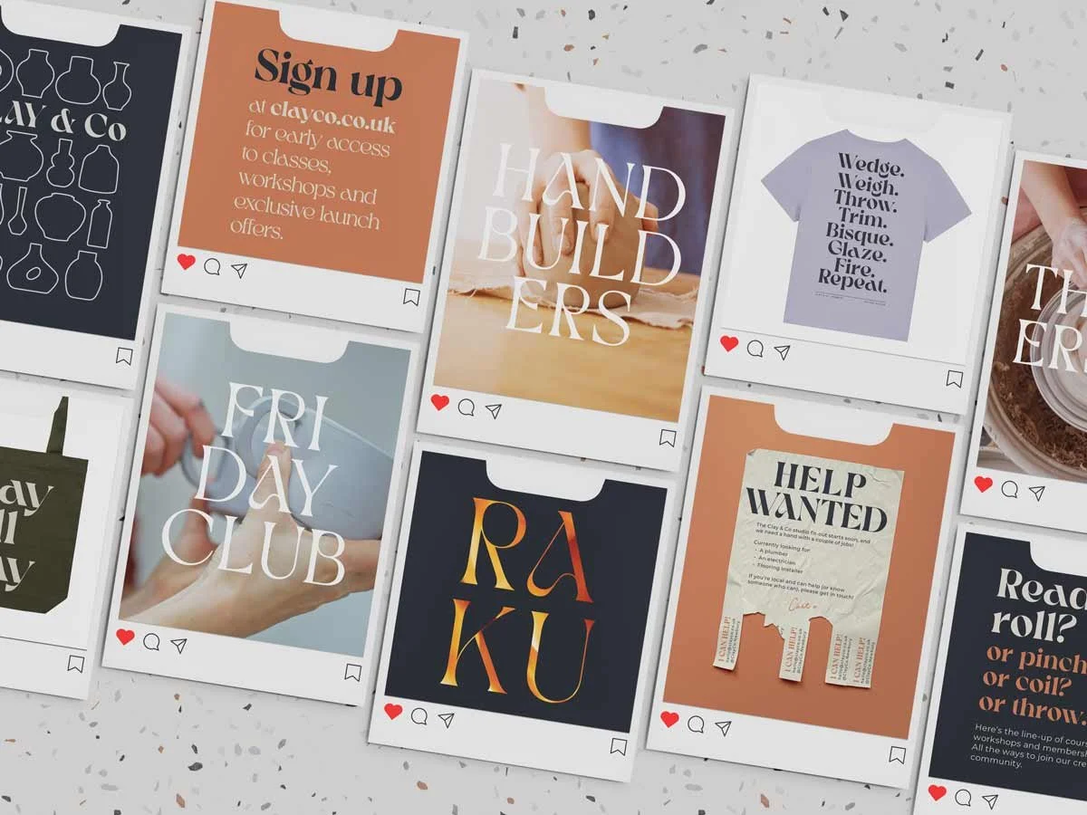
From there, we built out the brand. Strategy, tone of voice and a visual identity that feels soft, tactile and human.

STEP 2.
Launch: Building Demand Before Opening
The goal here was simple.
Don’t just launch… launch with momentum.
We focused on building an audience early and giving them a reason to engage:
Built an email list ahead of opening
Offered early access to classes as a reward for signing up
Created a clear journey from interest → sign-up → booking
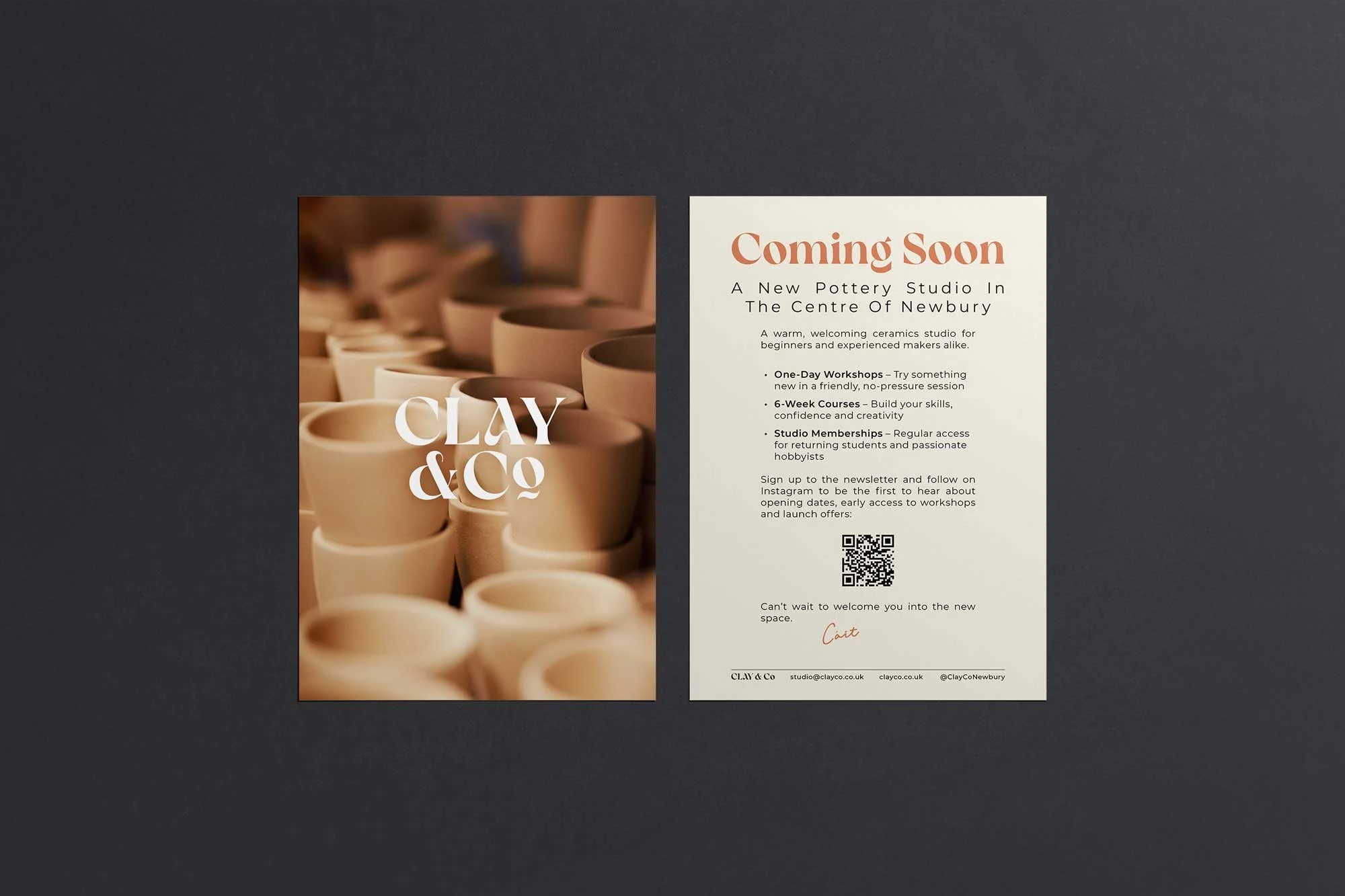
We also took things offline.
We suggested running a stall at a local artisan market, giving Cáit a chance to meet people, introduce the studio, and build awareness face-to-face.
Alongside that, we created printed promo to drive sign-ups both at the market and beyond.
On social, we:
Previewed upcoming workshops and courses
Shared progress of the studio fit-out
Built interest and momentum in the lead-up to launch
Everything pointed back to one goal:
Build an audience early, and make it easy for them to book.
STEP 3.
Grow: Keeping the Momentum Going
Once the doors opened, the focus shifted to keeping that energy going.
We’ve continued working together to:
Promote new workshops and memberships
Build a consistent social presence
Develop new ideas and content
Grow search visibility over time
Manage and update website
Use email newsletters to stay connected with an engaged audience
So it’s not just a strong launch.
It’s something that continues to build.
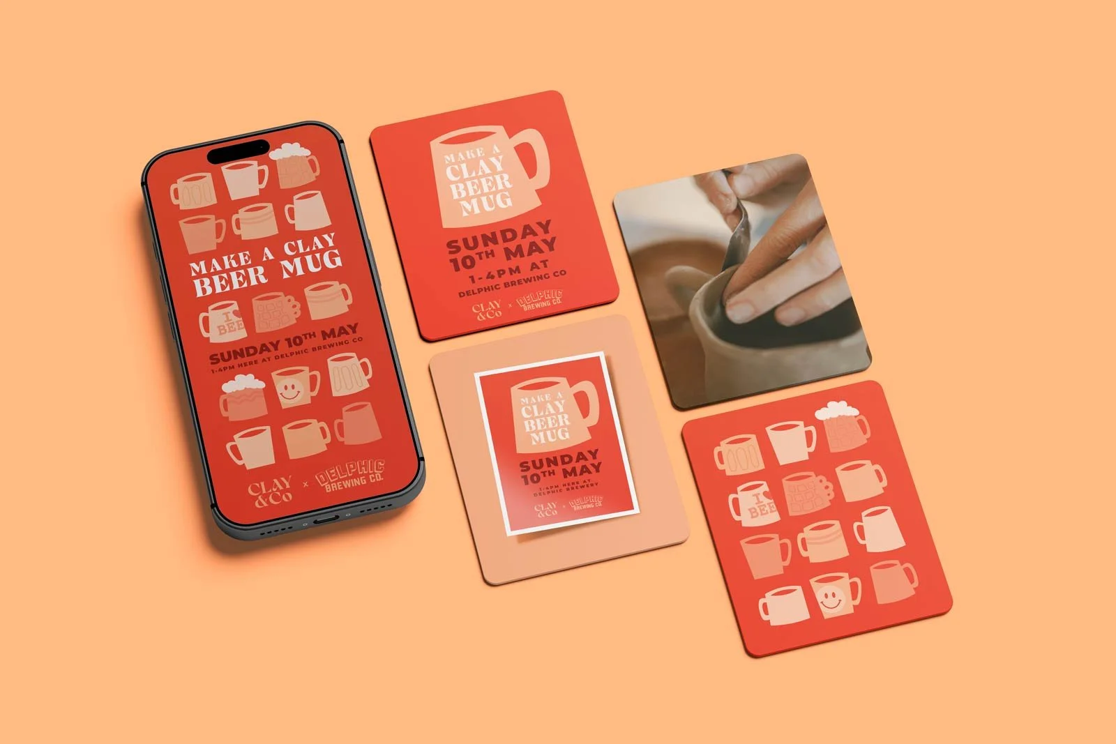
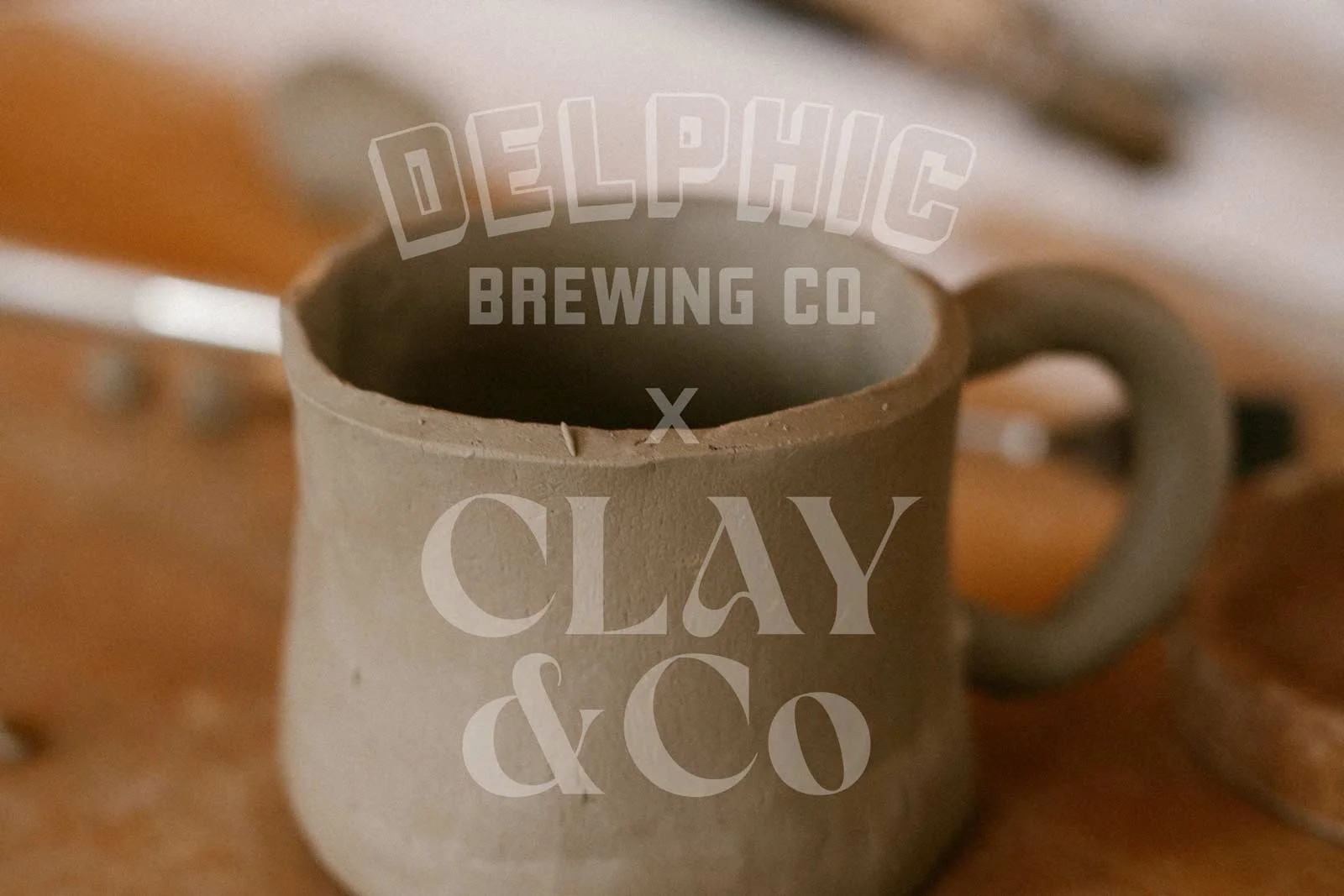
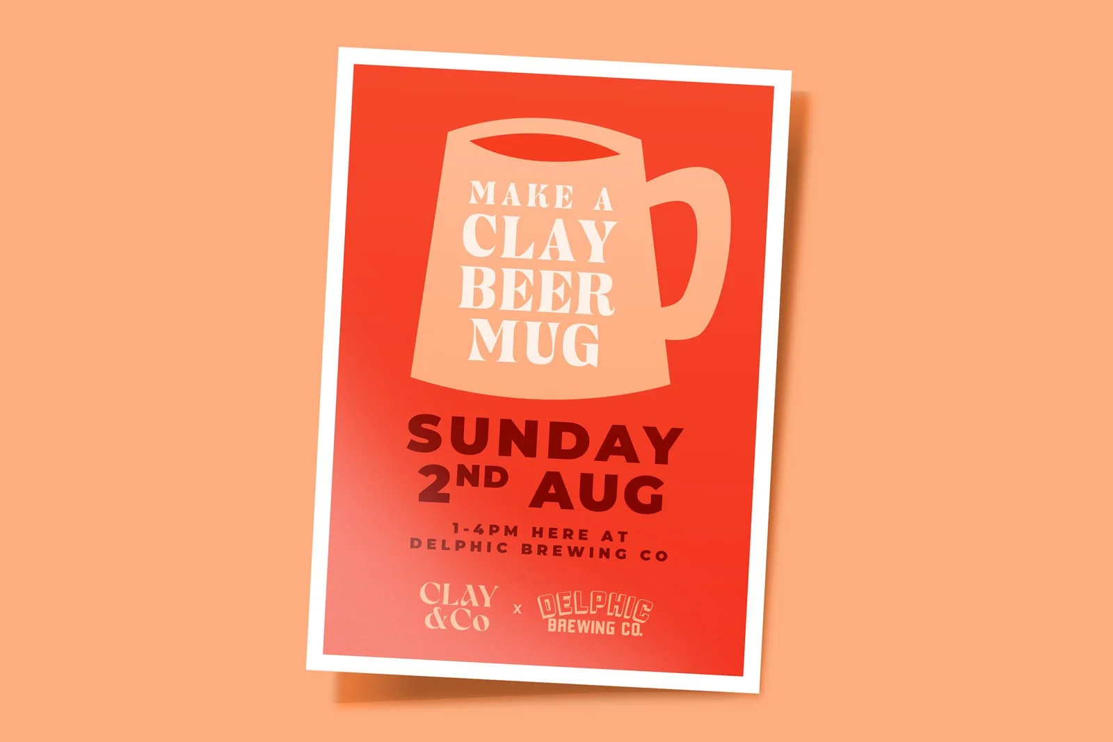
Clay&Co x Delphic
Campaign visuals for a fun collaborative workshop between Clay & co and Delphic Brewing Co.
We created a bold set of digital and print marketing aimed at Delphic’s audience which helped to sell out this workshop in a couple of hours.
The Outcome:
Clear positioning and a focused launch strategy built early demand and gave the studio real momentum from the start.
The goal from day one was to fill the first term of classes.
We got very close.
98% of classes filled in the first term
A solid, engaged email list ready to book
Strong local awareness through both digital and in-person activity
But more than that, it now feels like a proper brand.
Something people recognise, talk about, and want to be part of.

Why It Matters:
A lot of new businesses focus on getting the branding done and hope the rest follows.
But without building demand, it’s a gamble.
This worked because everything was connected.
Brand, launch strategy, content, and real-world promotion all pulling in the same direction.
Fancy Something Similar?
If you’re launching something new, or stepping into a bigger phase of your business and need it to work from day one, this is exactly where me and my team can help.
Book a free brand audit to see how we can build something like this for you.