W Store
Visual Identity + Marketing Content + Stationary
0 minute read
The Situation:
W Store was already doing a lot right.
Great products. Good taste. A space people enjoyed being in.
But the brand itself hadn’t quite caught up.
It felt a bit inconsistent, a bit underplayed. The kind of place you like when you’re in it, but might not immediately remember or talk about afterwards.
And that’s the gap we wanted to close.
The Approach:
Reset → Refine → Grow
This wasn’t about tearing everything down and starting again.
It was more about stepping back, figuring out what was already working, and then building a stronger, more recognisable brand around it.
STEP 1.
Reset: Getting Clear on the Direction
Before jumping into design, we needed to pin down what W Store actually is.
Not just what it sells, but how it should feel.
We landed on something that sits nicely between:
Design-led and curated
Trend-aware, but not chasing every trend
Approachable, but still considered
From there, everything else became much easier to define. Tone of voice, visual style, how bold or minimal to go… it all had a direction.
STEP 2.
Refine: Making It Feel Like One Brand
Once the direction was clear, the focus shifted to consistency.
We refined the identity so everything felt like it belonged together:
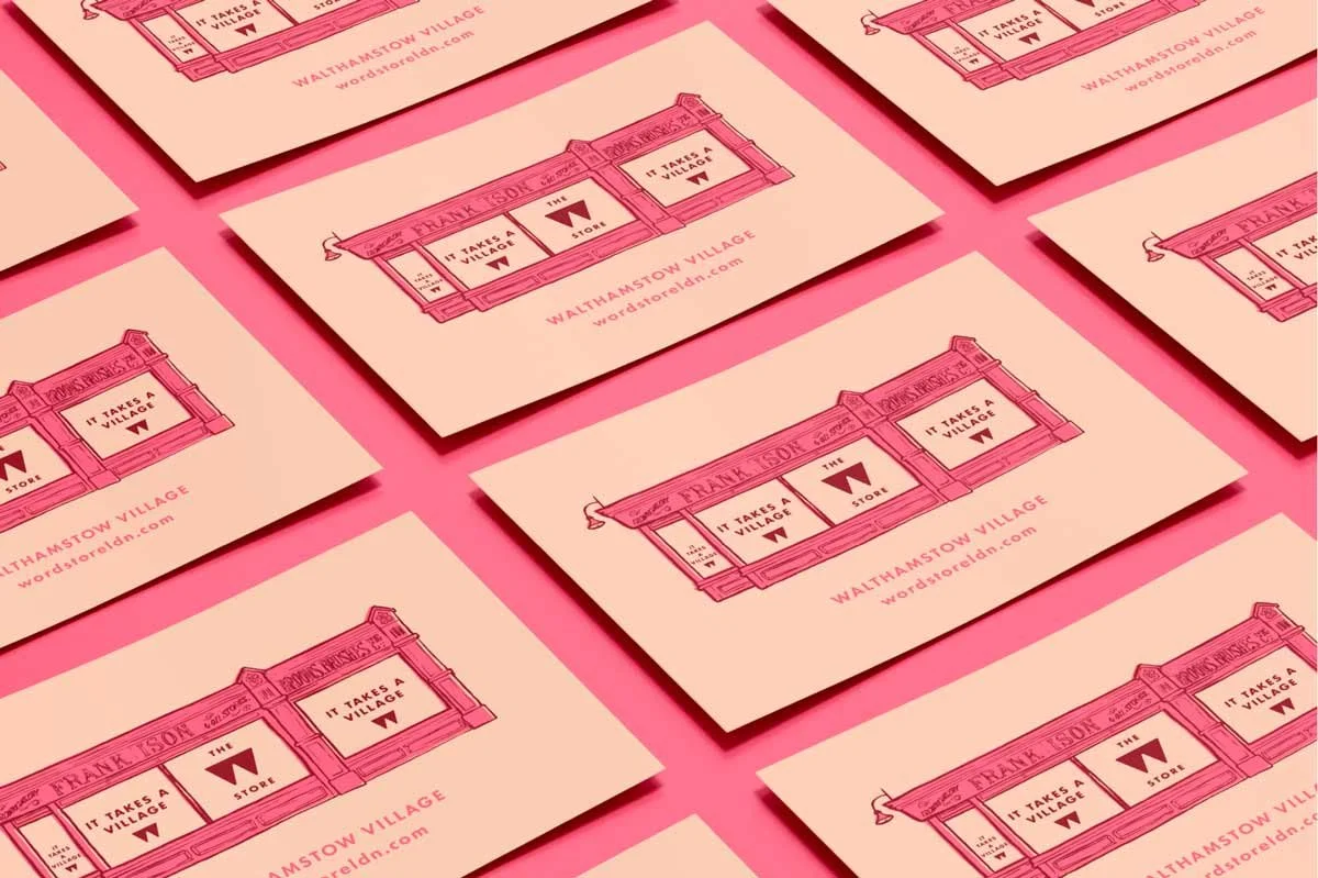
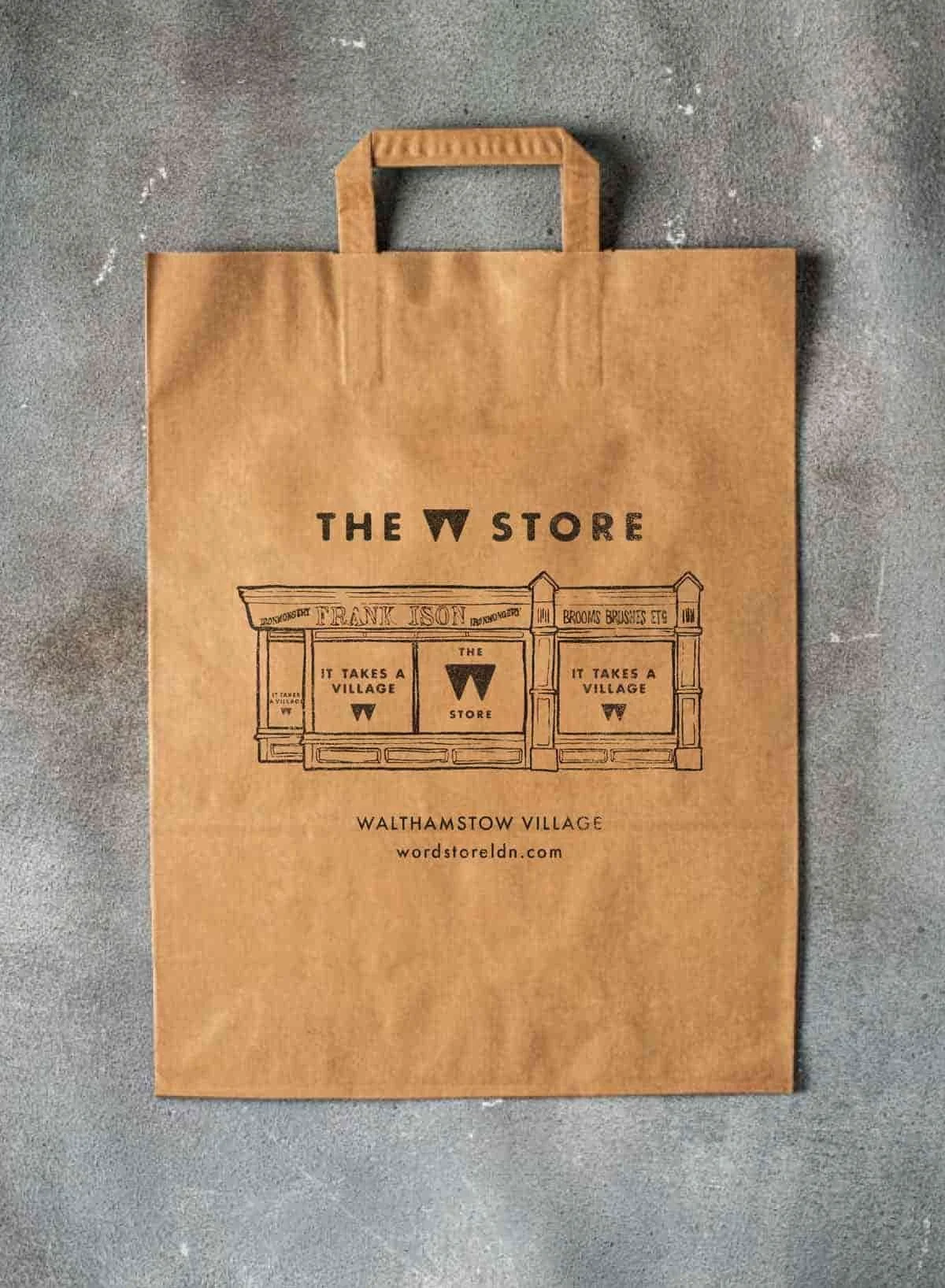
A cleaner, more confident logo setup
Stronger typography and layout choices
A more cohesive look across socials, print, and in-store
Nothing overcomplicated. Just tightening things up so wherever you see W Store, it feels familiar.

STEP 3.
Grow: Keeping It Moving
This is the bit that often gets missed.
Instead of doing a rebrand and leaving it there, we’ve kept working together to build the brand over time.
That’s included:
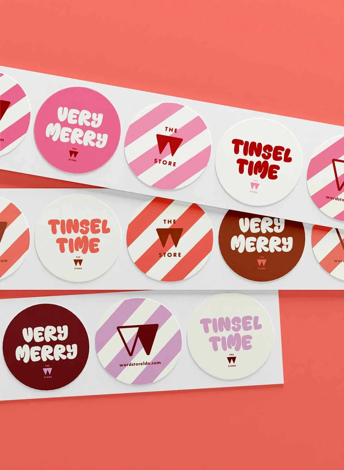
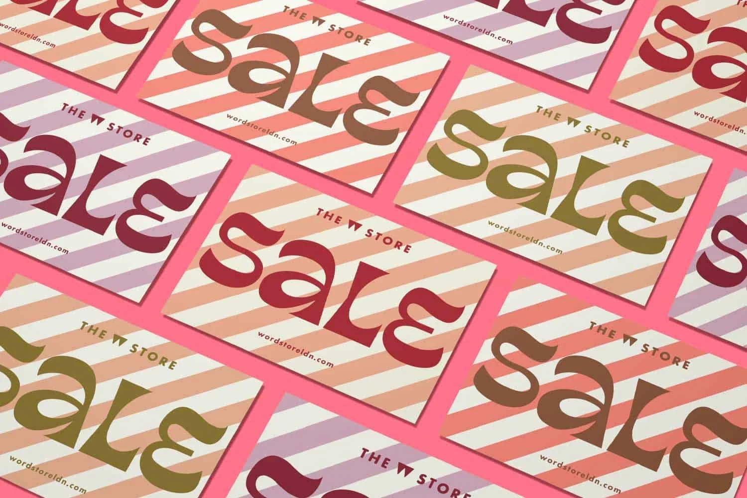
Ongoing social content and campaigns
In-store graphics and printed pieces
Seasonal updates and new ideas
So the brand doesn’t go stale or drift. It stays consistent, but still evolves.
The Outcome:
A defined brand direction brought consistency to the experience, making the shop more recognisable and cohesive.
W Store now feels like a proper brand, not just a well-curated shop.
A clear identity that supports the product range
A more recognisable and consistent presence
A stronger connection between in-store and online experience
Everything feels joined up, from the window display to the Instagram feed.
Why This Matters:
A lot of shops sit in this exact position.
They’ve got great products, but the brand isn’t quite pulling its weight.
And usually, it doesn’t need a dramatic overhaul. It just needs someone to come in, tighten things up, and give it a clear direction.
Working Together:
If your business is in that in-between stage, doing well but not quite feeling like a brand yet, that’s exactly where I can help.
Book a free brand audit to see how we can build a brand that elevates your product and brings it all together.